Showing posts with label BRIEF 7 FASHION SHOW. Show all posts

Thursday, 24 January 2013

CP // Fashion Show Pitch - Brief

Using the brief that I got during the briefing for this pitch, that I have used to produce a response to, I made notes of the key points for me to use to type it up.


Brief Labels
The way that I will label my blog posts in response to this brief will be as follows:
  • BRIEF 7 - As this brief fall under my College Pitches brief, all posts will be labelled with this overarching label.
  • BRIEF 7 FASHION SHOW - As well as the overarching label, this individual brief label will also be used to single out all the blog posts made solely in response to this particular brief.
  • BRIEF 7 DC - Any design context blog posts will be labelled with this.
As well as these, all posts will also be labelled with the mandatory OUGD303 and Design Practice labels. All blog post titles will begin with CP // Fashion Show Pitch.


Brief 7 Fashion Show

Using the notes that I made, I typed up my Fashion Show Pitch brief.


Tuesday, 15 January 2013

CP // Fashion Show Pitch - Pitch Boards

Using everything I have collected and produced, I put together my pitch boards to use to submit over to the guys at fashion.


To submit, I printed out a copy of the boards and put them in Laura Barker's pigeon hole in the fashion studios, and as well as this I emailed over a copy of the design boards to the email address given on the brief. Here's a screen shot of the submission... 


Hope they got it. Fingers crossed. Considering that I only had a few hours to produce this pitch, I am pleased with what I have come up with. 

CP // Fashion Show Pitch - Idea

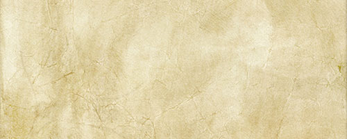
Thinking about the colour mentioned in the previous blog post, the idea of having a texture on that sort of colour would work quite nice. I'll just grab something off google for now to use as an example of what it would be like, then if my idea does happen to be chosen then I will look into creating my own.

I'm thinking something along the line of an antique paper type of background. Found a few possible examples to use.

(link)

(link)

(link)

Prefer the top one, I'll use this for what I produce. Like the faded ink in the second one too. Hmm. Could maybe have some sort of small graphic elements to add to the designs relating to fashion in a similar colour to try look like the same sort of thing?


Added the word graduate and 2012 to it in a similar colour with about 60% opacity to still see the texture under it. This works. Tried to not have it just put on so played around with spacing and positioning. Words used or number could be determined exactly at a later date.


Tried dashed lines in same way. This also works quite nice, and dashed lines could represent stitching?


Want to use a modern sans serif typeface. Tried a few out, decided on Gotham Rounded. Works nicely, also put it into a charcoal grey colour rather than black - this sits better on the background.

Hmm... logo? Don't know if there's a specific name or anything they would like to use. I've emailed once asking about submission and still haven't heard back so no point sending another email. I'll call it what they called the brief. Could be changed if wanted if chosen.


Applied this to the design. 


Figured seen as the logo basically repeats the title I have already used, so I replaced that with a larger logo. Also included the location, date and a made up time to the design also to give an idea of how simplistic the designs will be kept basically. Simple, to the point, not too fussy - let the background do the talking I reckon. Specific information and titles and what not would obviously be chosen by them not me. Also included a mocked up college logo too. 


So this will basically act sort of like a swatch of the basis of what designs would look like. The scale, format, etc would obviously depend on the media. I think this is a decent enough mock up to use, and is a good representation of what's basically in my head.


Outcomes
The outcomes have been listed on the brief, so suggesting possible ones is a bit pointless. Decided to quickly just collect a couple of examples of ideas for how some could be/work to include on the pitch boards to work along with the design swatch.

Invite 
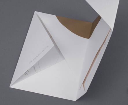
Could be a poster that folds down to be like an envelope? Then a ticket inside that will be used for access to the show - poster for people to pin up if they wish who's received it. Found a decent example to represent this.


Tickets
Could look like old fashioned tickets? Found an example.


Time's ticking, need to get pitch boards done.

CP // Fashion Show Pitch - Brief/Research

I weren't sure whether to pitch for this or not. I have a couple of decent ideas I think would be quite nice to do. When considering whether to I figured it would depend on when the submission date actually is.

It's today. Oh dear.

I may as well put together a pitch, I have nothing to loose by doing so. I heard someone saying that the cut off point is around 5.30? So only have a few hours. I'll see what I come up with/produce and see whether it's worth submitting. 

Brief
Here's the brief that we have been given for this pitch. I should consider rewriting this to fit the format of the rest of my briefs.


The key points that I picked out from this brief are:

  • Canal Mills is an old textile factory recently converted into an events space. We would like the history and character of the space to be used as direction for the concept of the graphics.
  • Clear, concise, professional, cutting edge, contemporary – Despite the rustic feel to the venue our vision for the interior of the event is clean and minimal.

I will work towards making sure that I convey aspects of these points within what I design. I think with the venue being an old textile factory, then a sort of vintage, old fashioned sort of feel to the designs would be quite nice, then then keeping it simple with a sans serif typeface to keep them still looking contemporary and cutting edge. 


Research
I'll look at the website for the venue to see what it is like as this may influence my design ideas. The website's canalmills.com.


The whole thing just feels rustic. These images are examples, there's more on the website. It looks like a nice location. I think the initial ideas that I am having as explained above would work quite nicely against this location.

Also, going to have a quick look at what comes up on google images for old textile factories. The link's


Main sort of colour that came up was like a dated cream colour, like sepia? Something to take into consideration.