...and breathe. It doesn’t seem like two minutes since it was my first day on the course, but here I am writing my last ever end of module evaluation after three (very intense) years.
As a whole, I am happy with how my final major project has panned out. I admit, I could probably have done more and pushed some of my briefs further than I have done, but then again, there’s always going to be something else and it’s knowing when to stop that’s the biggest challenge at times.
It didn’t start out so great though as I spent the majority of the first month concentrating on my dissertation and just getting done what I had to for this module – then, before I knew it, I was already a fifth into the module and hadn’t made any sort of significant progress. Oh dear. I quickly got myself into gear though and made a realistic time plan for how I would get everything done that I was planning. My time management skills with this module have definitely been put to the test, and I have to say I am rather impressed with myself with how well I did with it. I have managed to not only produce the minimum requirements of briefs to a standard that I am happy with along with my design context brief, I have also produced additional briefs alongside these that I am more than happy with.
Two of my main briefs were competition briefs for YCN, one of which was done in collaboration with Baljeet Samra. These briefs were interesting as the time that I had to produce these was cut short, which ultimately made them more intense than they ideally needed to have been. Nevertheless, I completed both and got them submitted in time to the competition in March, meaning I had already completed two of my significant briefs. For both of these, I produced designs that were mocked up in context to the location that they would go. By doing this, it has learnt me a hell of a lot about how to really make the most of the design areas that are available – there’s actually more shapes/sizes out there than a standard A sized piece of paper! Who’d have known?
As well as the YCN competition brief, I also collaborated with Baljeet Samra on a quick day brief that had full intentions to be fun and type/batman related. We have similar design styles and thought processes with briefs, so working together is a dream as we agree and disagree on the same things and somehow picture things the same. My collaboration skills have come along in heaps and bounds since first year after I nearly dropped out in the second week because of how much I hated it. I now no longer dread even the thought of it, which is something that I never thought would happen, and actually enjoy doing them. Saying this though, I also did a collaboration brief again with Baljeet, and Beth Yates and Lisa Whitaker that turned out to be a lot more effort than it should have been. It was a learning experience though in terms of working in a close knit group whilst also collaborating with ‘real’ clients.
My strongest brief within my final major project is definitely my Proper Coffee brief. This originally started out as a quick day brief after a portfolio surgery with
Ben from The Beautiful Meme, which soon escalated to become one of my main substantial briefs within the module. I really enjoyed producing the work for this brief as it combined my love of type and coffee perfectly. There wasn’t any underlying niggling reason for this brief, like it wasn’t a live brief or a competition one, so it allowed me to really get my teeth stuck into what I was doing and to do it how I wanted to do it (with feedback of course). I enjoyed it, and I think it’s a great back up plan to pursue if I don’t end up making it as a graphic designer.
As much as I couldn’t wait for the end of college to come to go off into the ‘real world’ and start earning some coin, now that it’s actually here it couldn’t be more scary. But thanks to the course, I do feel ready and prepared to go out there with my head held high with a portfolio in my hands that I am actually proud of. I couldn’t have asked for more from it really. Thank you.
Attendance - 3/5
Punctuality - 3/5
Quality of work - 4/5
Quantity of work - 4/5

Showing posts with label BRIEF 8. Show all posts
Showing posts with label BRIEF 8. Show all posts
Wednesday, 29 May 2013


Brief 8 - Design Board Submission
Here is my design board that I am submitting for Brief 8 - Geek Table Collective.


Tuesday, 28 May 2013
Geek Table - Brief 4 - Guilty Pleasure Brief Update
I made a couple of minor adjustments to the final Guilty Pleasure brief ready for the submission.


Geek Table - Brief 3 - Alter Ego Brief Update
I made a couple of minor adjustments to the final Alter Ego brief ready for the submission.


Geek Table - Brief 2 - Zone Brief Update
I made a couple of minor adjustments to the final Zone brief ready for the submission.


Geek Table - Brief 1 - Geek Role Brief Update
I made a couple of minor adjustments to the final Geek Role brief ready for the submission.


Brief 8 - Brief Update
In preparation for the submission, I have made some slight alterations to the brief for Geek Table.


Sunday, 19 May 2013
Brief 8 - Final Crit Design Boards
Although I haven't had the chance to do anymore of the prints for the geek table briefs yet except the alter ego one, I have decided to put together the design boards for them anyway ready to take along to the final crit. In the brief the requirement for them is to have a design board each, so that is what I did. I used the mocked up artwork for the print on one side and then put a box where the print will go on the other side, explaining inside it what will be there. I'm gutted that I haven't had the chance to actually have them printed for the crit, but at least I have one to take along.


Geek Table - Brief 3 - Alter Ego Prints
Following on from my experiments using the lino, the only brief that I can really get down for now with the lino that I have is my alter ego one as the 'na's will work out to be pretty small. I have decided also that due to the expense of the lino and what not that I will reduce the size of the finished prints to A4. This is me being more realistic with what I can achieve with this additional brief with the time ticking on.
Here's some photos of the process of these prints...


Here's some photos of the process of these prints...


I used a scalpel to guide me with where on the lino I needed to carve away, as well as to help me achieve a lot straighter edged for the type.
In total, I made 5 prints for this brief. I began with using just the silver ink, and then started experimenting a bit with adding white and black to the mix. Each one is slightly different to each other. Here are the 5 that I made.


I particularly like the ones where the 'na's look layered up over each other. As I did more with the 'na' pieces of lino (I did two), they became less and less crisp prints. The last one looks naff - definitely lesson learnt. Although considering the amount of times they were inked up and used it's not really surprising. Out of all of these 5, I like the second print the best and will use this one to represent and be the outcome for this brief (it will also be what goes into the GT publication to represent me).
In preparation for submissing the print to be used in the publication, I scanned it in and slightly played around with the levels on the image - this finished off the print nicely and I really like how it has turned out.

Brief 8 - Experiment
Before I made a start with one of my geek table brief prints, I had a quick experiment with the process of doing this using the triangle that I use for ImagineThat. Here's the photos that I took from this process. I actually really enjoyed it and can't wait to get stuck into doing the briefs now... just need to wait for the right sized lino to arrive.


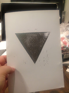
I love the uniqueness that lino printing has with each individual print. And I like how because I am doing it by hand rather than through a printing press that it doesn't print as clearly as it would. Need to make sure that I concentrate a bit better on the carved areas of the lino to make sure I get as little of the imperfections around the print as possible. Definitely something I can see myself getting really stuck into though - glad I made the decision to do this.


I love the uniqueness that lino printing has with each individual print. And I like how because I am doing it by hand rather than through a printing press that it doesn't print as clearly as it would. Need to make sure that I concentrate a bit better on the carved areas of the lino to make sure I get as little of the imperfections around the print as possible. Definitely something I can see myself getting really stuck into though - glad I made the decision to do this.
Brief 8 - Materials/Equipment
I had a good search online looking for the materials and equipment that I need in order to actually do the lino printing for my geek table briefs. The prices are pretty varied, but I have an aim of spending as little as possible on things like this for now as it would be a lot of money to get wasted if I don't decide to do anything with them beyond these briefs. I found that Ebay was my best bet.
put screen shots of stuff ordered here
Here's all of the stuff that I ordered... although I did order a bigger sized larger lino than what they have actually send so I need to message them to see what they will do about it.
put photos taken of all equipment here
put screen shots of stuff ordered here
Here's all of the stuff that I ordered... although I did order a bigger sized larger lino than what they have actually send so I need to message them to see what they will do about it.
put photos taken of all equipment here
Tuesday, 14 May 2013
Geek Table - Brief 4 - Guilty Pleasure Idea/Mock Up
I have left doing this one of the briefs a little late and am having to rush it a bit to get it done in time for the Geek Table crit. Trying to think of what my guilty pleasures are, as explained in the brief post, all I can really think of is music that I listen to that I wouldn't want people to know I secretly listened to. Hmm.
Was about to give up doing this brief for the time being until I remembered that it can be design related. Obviously as it's been explained numerous times, I am the Type Geek, but I do like a bit of hand drawn type too - could do this? Then I started thinking about colour, and again, people who know me know my favourite colour is blue (along with black and white), but no one really knows that I also really like purple. I like this idea better.
Taking into consideration also the restrictions of this brief, which is to design within a 210 x 210mm square, I have set myself also the target of producing A2 sized work. In the end I have decided to be 'clever' about it and have a 210 x 210mm square block of the colour purple within A2 - that way it is win win. I'll double check this though to make sure I am alright to do it.
Mocked this up really quick to take with me - obviously it will be lino printed.

Was about to give up doing this brief for the time being until I remembered that it can be design related. Obviously as it's been explained numerous times, I am the Type Geek, but I do like a bit of hand drawn type too - could do this? Then I started thinking about colour, and again, people who know me know my favourite colour is blue (along with black and white), but no one really knows that I also really like purple. I like this idea better.
Taking into consideration also the restrictions of this brief, which is to design within a 210 x 210mm square, I have set myself also the target of producing A2 sized work. In the end I have decided to be 'clever' about it and have a 210 x 210mm square block of the colour purple within A2 - that way it is win win. I'll double check this though to make sure I am alright to do it.
Mocked this up really quick to take with me - obviously it will be lino printed.

Geek Table - Brief 4 - Guilty Pleasure
The other of the two briefs that have been set for to be done for the same time is one based on our guilty pleasures. This can either be or not be design related, and must be kept personal. This is going to be a tricky one I reckon as the guilty pleasures that I can think of at the minute that I have are music related. Hmm, will have to see.
The title of this brief will be Guilty Pleasures, and using the same briefs as before I modified them to suit this one.

The title of this brief will be Guilty Pleasures, and using the same briefs as before I modified them to suit this one.

Labelling of blog posts will also follow the same as previous.
Geek Table - Brief 3 - Alter Ego Idea/Mock Up
As I explained in the brief post for the Alter Ego Geek Table brief, I already have a great idea that I would like to do. Anyone who knows me knows how much I love Batman, so to have that as my alter ego (I think) would be perfect.
Keeping it type related, the two most obvious things to use would either be the saying 'I'm Batman' which is usually in the Batman voice, or to do the whole 'na na na na na na na na Batman' thing. Thinking about it now though, I don't want to just completely be too obvious with it so I reckon just using the na na's without Batman on the end would work quite nicely. The colour scheme I could go for with this would work nice as being black/grey, and maybe yellow? Not too sure on yellow actually.
Looking at this from the lino printing point of view, I think having two sized 'na's would work well (and use less amount of lino). A bit like this...


Keeping it type related, the two most obvious things to use would either be the saying 'I'm Batman' which is usually in the Batman voice, or to do the whole 'na na na na na na na na Batman' thing. Thinking about it now though, I don't want to just completely be too obvious with it so I reckon just using the na na's without Batman on the end would work quite nicely. The colour scheme I could go for with this would work nice as being black/grey, and maybe yellow? Not too sure on yellow actually.
Looking at this from the lino printing point of view, I think having two sized 'na's would work well (and use less amount of lino). A bit like this...


I like what I did with the previous brief though where I had the elements overlap each other to create a third colour, which I think may work quite nicely with this brief too. I have decided that I am definitely going to be using shades of grey and not just black, and definitely not going to use yellow.


Here's a couple of examples of how this could be - I guess how it turns out will be determined how I actually do the logo but do think that having them all overlapping each other will work quite nice. I'm excited to do this one.
Geek Table - Brief 3 - Alter Ego
For the next few weeks, we have decided to set two briefs for us to answer rather than one as there is longer to do them due to us being off Uni. The first of the briefs is Alter Ego. So what we would be doing instead of designing, or along those sort of lines. I think this will be an interesting thing to do as I already have the perfect idea of what to do for it! Also, there hasn't been any restrictions set for this brief.
The title of this Geek Table brief will be Alter Ego, and using the briefs that I have already done for the previous ones I modified this to suit this weeks theme.

The same theme of labelling for this will be used like previous.
The title of this Geek Table brief will be Alter Ego, and using the briefs that I have already done for the previous ones I modified this to suit this weeks theme.

The same theme of labelling for this will be used like previous.
Friday, 29 March 2013
Geek Table - Brief 2 - Zone Idea/Mock Up
For this brief, I'm going to do the same as I did for the last one where I mock up the idea for how it would ideally look when I actually produce it as I still need to look into buying the stuff I need in order to actually do the prints.
In terms of the idea though, I have no idea. Oh dear.
The obvious choice is music as I've always got music on, especially in the studios. But what could I do with that that still relates to type?

In terms of the idea though, I have no idea. Oh dear.
The obvious choice is music as I've always got music on, especially in the studios. But what could I do with that that still relates to type?
- band/artists names
- song names for lots of songs
- song lyrics from specific song
- lines from lots of different songs
- hmm
Not really feeling this though, and the fact it's to be orange isn't too thrilling either.
Usually, when I have stuff I have to have done for what ever reason (crit, deadline, print slot, etc), after I've done procrastinating for way longer than I should I usually then make a cup of coffee and get my headphones on and have music turned up really loud.
That's it! - what gets me in the zone is music and coffee. Could do something with this.
I want to have a print that is a little more adventurous/experimental than the last one so I could maybe have the words overlap?
Idea
I like the idea to have the words overlap, and then I could use two different shades of orange then the areas that do overlap could potentially mix a third? HMM.
With this whole brief being about being 'in the zone' though, I could print both words coffee and music over the top of the word zone, that way they would be... yes, 'in' the 'zone'. Clever. I'll have zone printed in one colour first, then print over the top both the words coffee and music that fill the same sort of area that the word zone does in a different colour.
If this works out how I am imagining it to, then it could look pretty cool. Here's the mock up developments of the idea that I made.


Monday, 4 March 2013
Geek Table - Brief 2 - Zone
Due to the changes regarding the exhibition that we are planning, the crit for brief 1 has been altered to being a week early and I didn't find out about this until an hour before so unfortunately I missed the actual crit happening, but did manage to catch the end of it where we discussed the theme for brief 2. It has been decided that the briefs will now be 1 week briefs rather than 2 week ones in order to get enough outcomes in time for the exhibition which is now proposed to be held in april rather than may.
This weeks theme is for us to look into what it is that gets us 'in the zone' when designing, and what sort of stuff gets us inspired. There has been a restriction set on this weeks brief, where we can only use the colour orange. This can include any shades of orange and not just one specific shade. This is to be done by next Monday 4th March.
I've decided to title this brie Zone, and typed it up using the one from last week and editing it as needed.

The blog posts will be labelled with the overarching brief label Brief 8, as well as the mini brief label which will be Brief 8 Zone. Any design context posts I do for this will use the main blog DC label Brief 8 DC.
This weeks theme is for us to look into what it is that gets us 'in the zone' when designing, and what sort of stuff gets us inspired. There has been a restriction set on this weeks brief, where we can only use the colour orange. This can include any shades of orange and not just one specific shade. This is to be done by next Monday 4th March.
I've decided to title this brie Zone, and typed it up using the one from last week and editing it as needed.

The blog posts will be labelled with the overarching brief label Brief 8, as well as the mini brief label which will be Brief 8 Zone. Any design context posts I do for this will use the main blog DC label Brief 8 DC.
Geek Table - Brief 1 - Geek Role Idea/Mock Up
Following the decisions that I have made regarding the outcomes that I produce for these briefs, I started thinking about what I could do for this first brief.
What makes me a geek? What makes me a type geek?
Thinking about this, alongside what I am looking into for my design context brief where I am exploring why I want to be a designer, I think the bottom line for both of them comes from the fact that I just love doing what I do.
So how can the fact that I love designing be translated into a lino printed outcome for my first brief. Well, why type geek? Because I prefer to use type for a massive number of reasons. Hmm. Well, I do say quite often that I love type, so that's what I will produce.
Immediately, I have thought about the Milton Glasier I heart NY piece that is everywhere now, and think altering this to say type instead would be quite nice, and having it lino printed will translate pretty well as they wont all turn out absolutely perfect if I choose to produce more than one outcome. Hmm. I still need to look into getting some stuff to be able to do this.
I've mocked up what I want to do. The type will be in black, and then the heard will be red - meaning I will be producing a two colour handprinted lino print. Nice.

I've used a bold typeface as I want to have a large enough surface area for the print to translate on to the stock well, and I also want to have that sort of hand printed not perfect look to it. I haven't coloured the heart in as I don't really need to for this mock up. In the crit I will explain what I am doing as I haven't got the resources yet to be able to produce it.
Geek Table - Briefs Outcomes
I want to use these mini briefs to have fun with. I don't want to take them too serious or spend way too much time on them. I really fancy producing outcomes that don't just come out of a printer, so have decided to look into other printing techniques. The first obvious answer to this is to screen print, but I am doing another brief which is screen print heavy so I have decided to consider another way.
I would love to be able to do things like woodblock type for this, but it is a bit impossible to do so I had an idea to try a different approach which could be similar, and that's lino printing. I could carve letters out of the lino to use to print. In my head it would work, so need to try it out. So I have decided that for my mini brief outcomes, this is the method of production that I will use.
Also, unless any restrictions are given where a specific shape or size is to be used for the outcome, I will stick to producing A2 outcomes as this will make what I produce more interesting and have to put more thought into it.
I need to buy some lino stuff now - I'll look into this.
Subscribe to:
Posts (Atom)