Monday 25 February 2013

Lego - Survey

I'm really liking the illustrations that I have been working on and reckon I could do something with them. I want to make sure that I do ones that are actually relevant and not just ones I think are right so going to do a quick survey.

I want to keep it as simple as I can so going to stick to just the one question.


I'll give it a few days and keep asking people do do it for me, hopefully I will get a variety of responses to work with for my brief.

Wednesday 20 February 2013

Lego - Drawing Around

Using the idea of making something using lego block illustrations and then drawing around them to show more detail for what it is supposed to be, I've decided to give it a go with actual things someone would maybe make out of Lego.

First thing I thought of was a tree.


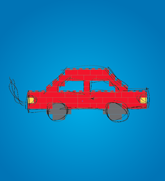
Hmm. Works well with this. Next I tried out a car. Keeping in mind the idea with the messy lines as pointed out previously.


Looking at the lines without the lego blocks behind is interesting ha.


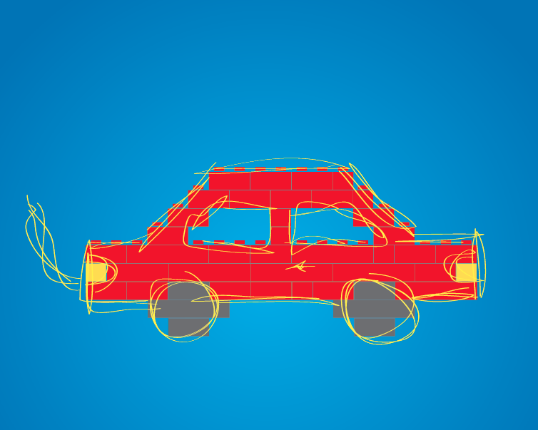
I think this is working pretty well and might be on to something with it. Decided to experiment further with the car one (because that's a bit more interesting than the tree one). Tried out a coloured background - decided to use a slight gradient with this to add a bit more effect to it.


Looks alright actually on the coloured background. Not sure if the black lines are working though. Hmm. Decided to try them white and also played a bit with the opacity of them too. I just don't want to distract too far from the fact the thing is actually made to look like it is made from lego.


Decided to try the lines out in a colour, tried a few and found the yellow works quite nice with this. Stands out a bit better than the black and white ones do.


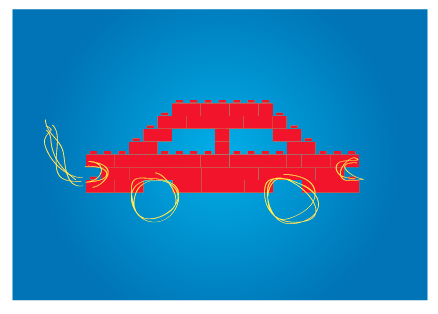
Had a thought to see how it might work having the lines, and then just parts of the lego car in the background instead of the full thing to maybe suggest it being built? Also tried with just the lines and no lego things that works quite nice too. Think I do need to have a bit more reference to lego than that though.


When I was doing this I had a thought to maybe just have certain aspects of the car? Like just wheels or what ever. I tried this out.


I think this has an interesting effect to it actually. Tried it with each individual ones just there as well with the lines.


And again, but this time without the lines and just the different aspects of the car. For this to work I reckon it might need to be part of a set some how.


Again just the different aspects, this time with the lines that also just go round the different aspects.


Having the lego sections for certain aspects, and then the lines for the aspects that are missing...


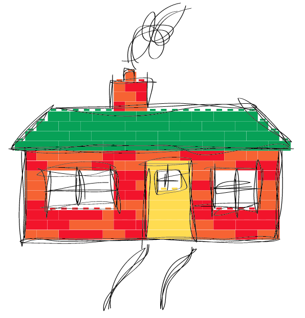
I like these. Moving on from the car now, decided to have a go at doing a house - used to love building houses out of lego when I was younger.


Ended up with this (above). Not sure if I am being too precise with it? Decided to experiment with the colours of it make it seem a bit more realistic to it actually been done by lego?


Not really feeling the house one as much as the car one. Time to move on I reckon. Decided to try a dinosaur/dragon thing.


Quite like this one actually. Again tried it on the background and what not, and this time quickly looked how this sort of thing works along with having the logo. Nothings decided yet or anything but thought I would see.


I'm quite liking these actually. The car and dragon thing works better than the house - so simpler ones work better, something to keep in mind. I really need to start making some decisions with this and figure out exactly what I want to achieve, then I can figure out if these are actually useful for that or not. 

Lego - Few Ideas Pt 2

Taking where I ended up from the last Lego post with the word 'basic' made out of what looks like Lego pieces, I think this is quite interesting to had a bit of an experiment around with this.

Lego is colourful, so changed the colours.


I'm not massively confident with using colour sometimes but think this looks alright. Trying to stick with lego sort of colours. Obviously this isn't in context with anything else so may not work if I did come to using it.

When I first considered this brief and the whole back to basic thing, I had an idea to maybe make things out of lego bricks, and then draw around it to illustrate what it is supposed to be or what the person who has built it is imagining it to be. Decided to have a play around with this with the word I've done and drew around it using the paint brush tool on Illustrator.


I quite like this actually. The thinness of the lines doesn't distract too much away from them actually being lego built words behind it. I did this using the trackpad so going to have to get the graphics tablet out see how it works with that. I had a look see what the lines looks like without the lego letters behind it...


It looks like a sketch - which is interesting. It could maybe suggest that this is sort of like the guidelines that were followed in order to make the letters out of lego? The black lines don't stand out too well on the blue and a bit with the red so changed these slightly to allow the lines to stand out more. 


Think I prefer the original colours more but the lines do work better on this. I changed them around so that the letters are over the lines to suggest the lines were drawn first and then the letters were built within them.


Not as keen on it being this way around than the other way around actually. I like the way that the lines over the yellow B works, so changed all of the letters to match this see how it looks. Tried this both ways around.


The lines over the top of the letters works best I think. Got my graphics tablet out, so having a try at doing this a few times.

1. 


2.


3.


4.


The first one turned out quite neat, which I am not so keen on. I think the reason why I like the original one I did was because it was sketchy. The second I tried being messier when using the pen - harder to do really than it was with the trackpad in terms of trying to not be neat. Then with the third I decided to have a go with just a single line going around, changed the pt size of it too as it doesn't stand out as well with it being just 1pt. Then the fourth I tried being rougher with the lines while being neat.

I thought it would be better with the graphics tablet, but prefer the original one that I did so might just stick with that. The size of the actual image is huge, so resized it down to a reasonable size. The lines immediately didn't look the same, so experimented with different point sizes for this to see whick works the best at this scale.


The thinner lines work the best because it shows more detail within the lines. Decided to have a play around with different colour combinations.


And decided to throw in coloured backgrounds to the mix too.


Hmm.