
Lego is colourful, so changed the colours.

I'm not massively confident with using colour sometimes but think this looks alright. Trying to stick with lego sort of colours. Obviously this isn't in context with anything else so may not work if I did come to using it.
When I first considered this brief and the whole back to basic thing, I had an idea to maybe make things out of lego bricks, and then draw around it to illustrate what it is supposed to be or what the person who has built it is imagining it to be. Decided to have a play around with this with the word I've done and drew around it using the paint brush tool on Illustrator.

I quite like this actually. The thinness of the lines doesn't distract too much away from them actually being lego built words behind it. I did this using the trackpad so going to have to get the graphics tablet out see how it works with that. I had a look see what the lines looks like without the lego letters behind it...

It looks like a sketch - which is interesting. It could maybe suggest that this is sort of like the guidelines that were followed in order to make the letters out of lego? The black lines don't stand out too well on the blue and a bit with the red so changed these slightly to allow the lines to stand out more.

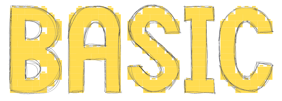
Think I prefer the original colours more but the lines do work better on this. I changed them around so that the letters are over the lines to suggest the lines were drawn first and then the letters were built within them.

Not as keen on it being this way around than the other way around actually. I like the way that the lines over the yellow B works, so changed all of the letters to match this see how it looks. Tried this both ways around.


The lines over the top of the letters works best I think. Got my graphics tablet out, so having a try at doing this a few times.
1.

2.


3.


4.


The first one turned out quite neat, which I am not so keen on. I think the reason why I like the original one I did was because it was sketchy. The second I tried being messier when using the pen - harder to do really than it was with the trackpad in terms of trying to not be neat. Then with the third I decided to have a go with just a single line going around, changed the pt size of it too as it doesn't stand out as well with it being just 1pt. Then the fourth I tried being rougher with the lines while being neat.
I thought it would be better with the graphics tablet, but prefer the original one that I did so might just stick with that. The size of the actual image is huge, so resized it down to a reasonable size. The lines immediately didn't look the same, so experimented with different point sizes for this to see whick works the best at this scale.


The thinner lines work the best because it shows more detail within the lines. Decided to have a play around with different colour combinations.


And decided to throw in coloured backgrounds to the mix too.


Hmm.
No comments:
Post a Comment