
I put the bounding line on first. I tried to keep it in a similar sort of proportion to how it is on the print out, and then I added one of the images Alison sent us to this to see what sort of scale would be achieved for it. We have all said how their sort of images work better on a larger scale so we want to try and allow as much space for them as possible so they can be as big as possible - we reckon this is what let the yearbook down for last years.

Considering the way that the print out folds, and how there is 8 sections to it when it is folded out, I've decided that I will work with this in mind for the PDF too. Obviously there wont be the actual sections but it may add to the consistency over both print and screen designs.
So with this in mind, I split the right side of the 'dps' in half, and started working on the design for this section of the PDF that will hold all of the information about the student. I reckon for the bottom section like I have done for the front cover of the print, this could carry quite nice info the same section of the dps, but on this instead have the information about what project is being featured. So I just basically copied most of the information into this part (left the completely unnecessary stuff off).

This works well along side the image I previously added to the layout.

Following the rest of the structure to the example that they gave us, I have decided to literally just mimic that, but obviously making it relevant to what we will be needing. The whole right section of the print out fold example that they gave us is in different sections. It begins with the title 'general notes' which can be replaced with the students name, then under this is the notes, so the information/blurb that the student gives us would work nicely just under that. Under this then is 'construction notes' but I can replace this with their contact information, and then for this bit they have A, B, etc in circles with notes next to it, so I could use a similar sort of thing but have the letter for each piece of contact information in the circle and then that actual information at the side. Then under this is the key section that I have touched on previously and then the project information that I have.
So I mocked this up, experimenting and playing around with it until I was pleased with it.


This works really well in my opinion. I will ask the guys what they think to it and see if it needs amendments or what ever.
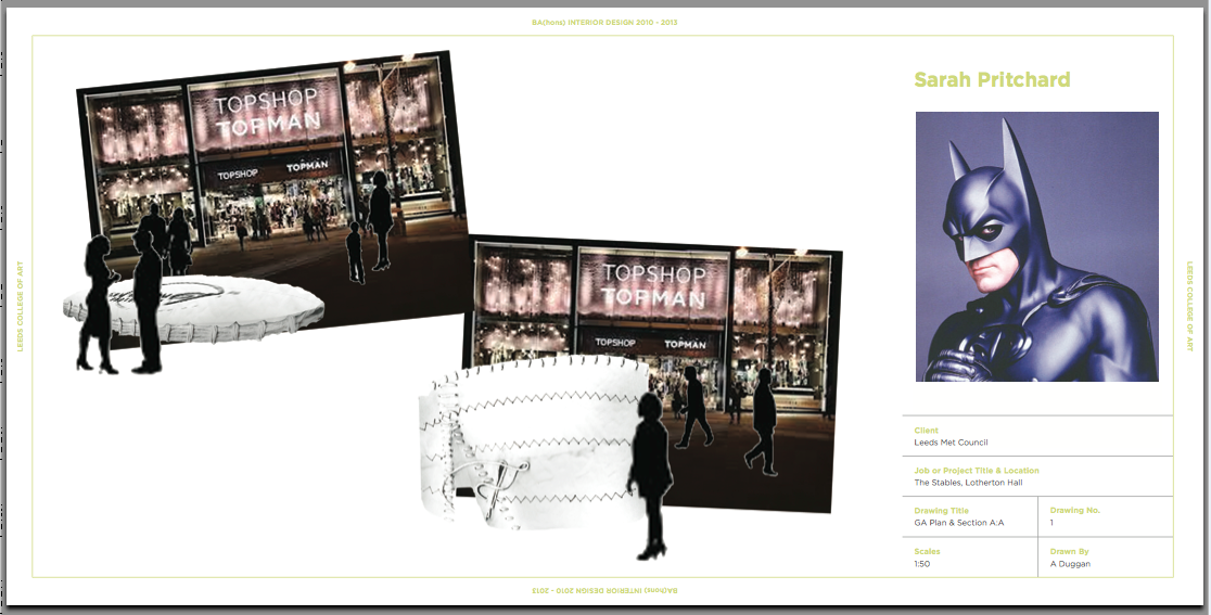
We discussed that because it is just PDF and we don't have to consider any budget for it, that we could maybe have 2 dps's for each student - this will allow us to have larger images for them rather than having more smaller ones fitting within one dps. Also, it was discussed that the students want to have images of themselves. So I thought that basically using the same structure again for the second dps, but this time replacing the blurb, contact info and key with an image of them might work? Obviously I used Batman to mock it up. Also used a different image for this one.
Not so keen on having the image like that actually. Hmm. Maybe we could still use images, but instead not have them with the work but have they just on a one dps all together? I'll mock it up and see what they guys say.

Literally just measured out having them and used squares for it - similar process to the thumbnails really. Hmm. They did mention about not having close up photos though, so mocked up a second idea for how it could be this time using images (Batman of course!).

Oh dear ha, I love Batman. I'll see what they say, not too sure if I'm keen on this really. Love the image of Batman in the bottom right though ha.
No comments:
Post a Comment