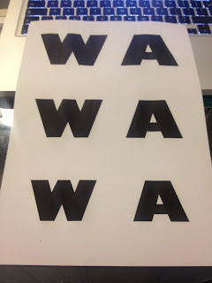
I've decided to print out each individual typeface consisting of a variety of sizes using the letter W (because this is one of the widest letterforms) so that I can start to see what sort of areas and sizes I would physically be working with and which would be the biggest and smallest to go.
The sizes that work the best are the two at the bottom of the pages - largest being 200pt and smallest being 150pt. The thinner ones suit 200pt better and bolder ones suit 150pt better.
Also, I think the Helvetica Neue typeface is a tad too thin, but I've just checked and there is a slightly bolder version of it so I have decided to change this to that from now on. So instead of Helvetica Neue Heavy, I will be using Helvetica Neue Black.
Decided to do another little test, this time using three different sizes, 200pt, 175pt and 150pt this time, and also used W again but A as well.
I think the 175pt is certainly a happy medium, and the new weight of helvetica works better than the other one.
I decided to make each individual typeface a different colour to each other and then put them all on top of each other to see how big the differences was like in terms of the width and height despite them being the same pt size.
Not massive differences, but it is the Gill Sans letterforms that take up the most room in terms of the width, so decided to alter the pt sizes of all of the other typefaces (except Futura) so that the letterforms are all the same height.
Might not seem much, but the differences were quite a few pts, which can allow that bit more area to doodle on which is probably quite needed in for the thinner ones. So the new pt sizes for each individual typeface is as follows:
- Helvetica Neue Heavy - 183pt
- Futura Condensed ExtraBold - 175pt
- Gotham Ultra - 187pt
- Univers Extra Black - 181pt
- Gill Sans Ultra Bold - 175pt
If I decide to use them slightly bigger or smaller, I will be sure to keep them in the same sort of proportion to each other.
I've decided to measure around the Gill Sans letterforms as this is the widest typeface to work out what the smallest amount of space I would need to use is.
The box around the W measures 76mm x 47mm. I tried out every other letterform to make sure that there isn't any that is wider than this, but this made me realise just how wide this W actually is. Even the M isn't anywhere near as wide. Stupid W. Never mind though. Those measurements are as shown above, right up to the edges of the W letterform, so the idea I decide on would need to be at least slightly bigger than this to have a bit of white space around it.
I put the boxes around the letterforms from the other typefaces as well just to see what sort of space would be around them in the squares compared to this one.
The biggest difference is with Future compared to Gill Sans with it being a condensed typeface. I'm pretty happy with these though overall.


No comments:
Post a Comment