
First I needed to measure out ideally how much area for each individual thumbnail I would have, for both the image and information. I've decided to work with just this section, so on a 420 x 420mm square to ensure that I don't get distracted by what I have done with the cover already.
Keeping the line around the edge of the whole thing (not sure if I have mentioned this yet?) the same, I used guides to measure out where these would go and also where the folds would be.

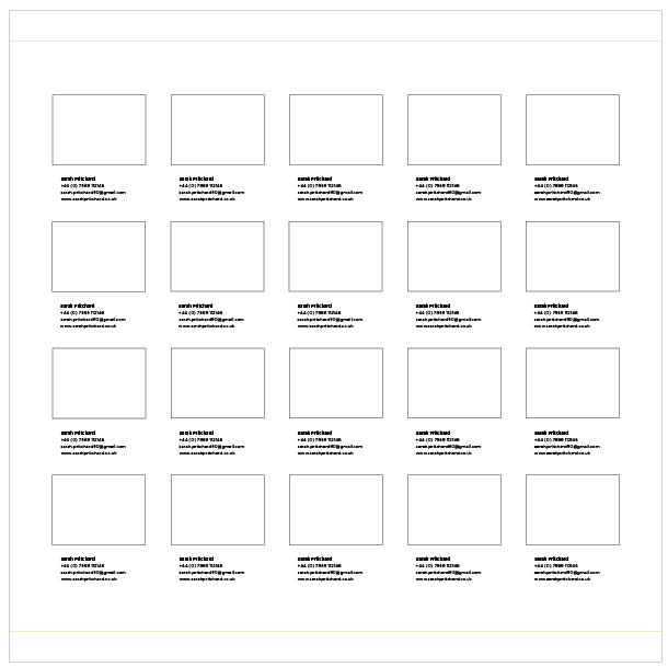
There's 18 students all together, so the best way to fit it within the space is to section it off 4 by 5 so that there would be 20 spaces, and then use 18 of them (could explain about the PDF in the other 2 spaces?). Decided to try both ways, so 4 across and 5 down as well as 5 across and 4 down to see which would give the best sort of area to work with within each space.


The 5 across by 4 down works the best as it will give better space to have a better shaped thumbnail. Within the spaces then I measured out the actual space that I would get and included gutters between them.


Using one of the individual spaces then, I worked out how to have the information first - obviously used the name (used my details for now), and phone number, email address and URL. Basically what we would use if it was GD, so should be the same info for them too? Then once I got the info done I worked out then what size I could have the thumbnail to fill the rest of the space.


Now I'm happy with this, I copied and pasted this then into each of the individual spaces. Haven't got anyones details for this yet so just going to repeat mine to give the idea of how it would look.


I shifted the info section in slightly from the very edge of where the thumbnail would be, and then shifted it down a bit to free up a bit of space around it. The overall thing though is a little bit too 'full' for my liking. They mentioned that they wanted plenty of white space, so going to reduce the size of the thumbnails a bit to allow more space around these as well.


Reduced them twice. Prefer the smaller ones with there being more white space in the whole thing so sits a lot more comfortable on the overall layout. I put the front cover section next to it to see how it works alongside it.

Looks alright, need to play around a bit more with the size of the thumbnails though I think. Made them not as tall but kept the width, then closed the space in between the thumbnails to allow more space around the edge.

This looks better and works better I reckon.
Alison, one of the Interior Design team, has sent us over a few examples of the sort of work that they do to give us an idea of what it is like, so I've decided using these to make a selection of thumbnails from them to use in place of the boxes to get a better idea of whether it is working.

Looks fine, the gutters between the sections are definitely wide enough to avoid them merging into one. Obviously this work is all sort of similar and the variety of work and thumbnails that we will actually have will look different to this but gives a good enough idea for now.
No comments:
Post a Comment